The Helvetica Font Has Been Revamped for the First Time in Decades

The Helvetica font family is everywhere. It’s used on everything from subway signage to federal tax forms to advertisements for a diverse group of companies, including Harley-Davidson, Oral-B, and Target. Job seekers are also likely familiar with its clean, sans-serif characters, which make it one of the best fonts for a resume.
“If it's me, [I’m using] Helvetica,” Matt Luckhurst, a graphic designer, told Bloomberg in 2015. “Helvetica is beautiful. There is only one Helvetica.”
Until now. As Wired reports, the typeface has just been revamped for the first time in decades by Monotype, which boasts the world’s largest type library and owns the rights to Helvetica. The new and improved version, called Helvetica Now, aims to better serve modern users while also working out the kinks associated with the old design.

While Helvetica is still ubiquitous, several major companies—including Google, Apple, IBM, and Netflix—have dropped the typeface for branding purposes in recent years. Issues related to kerning, punctuation sizes, and scrunched characters are all common gripes with the old version.
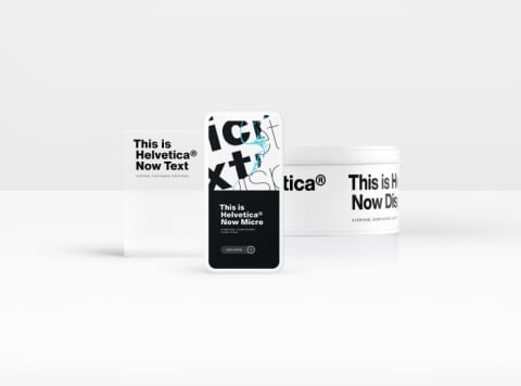
By contrast, Helvetica Now comes in three versions to suit different needs. There’s a Micro version for small screens, a Display version for larger type sizes, and a Text version that makes use of white space to offset visually “demanding” designs. Companies will need to buy the license to the new Helvetica, but the font’s creators are hopeful that everyone will be making the switch in due time.
“Helvetica Now is the tummy-tuck, facelift, and lip filler we’ve been wanting, but were too afraid to ask for,” graphic designer Abbott Miller, a partner at design consultancy Pentagram, said in a statement. “It offers beautifully drawn alternates to some of Helvetica’s most awkward moments, giving it a surprisingly, thrillingly contemporary character.”
The original Helvetica was invented in 1957 by two Swiss designers who dubbed their typeface Neue Haas Grotesk. It wasn’t until 1961 that the typeface was renamed Helvetica, and the font’s last major facelift came in 1982 with the release of the desktop-friendly Neue Helvetica.
Of course, that was pre-internet, and Monotype’s director, Charles Nix, says everyone's font needs have changed a great deal in the intervening decades. “Neue Helvetica was the first digitization of Helvetica,” Nix said. “That was a long time ago, and so much has happened in our world since then.”
[h/t Wired]