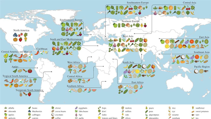
New tariffs on imported goods are set to go into effect on Saturday, April 5, and many people are wondering how it will affect their grocery bills. The U.S. brings in more food products from abroad than it sends out, which means most Americans rely on foreign-grown goods to get dinner on the table. To see how your meal plans might be affected, check out this interactive map showing the origins of crops around the world.
This tool was originally published by the International Center for Tropical Agriculture (which goes by the Spanish acronym CIAT) as part of a study in 2016. You can see which countries provide which crops to the global food supply by hovering over them. For example, bringing your cursor over the U.S. shows that the blueberries, cranberries, and grapes you buy likely originated here. Mexico and Central America, meanwhile, produce avocados, corn, and chili peppers, while West Africa provides much of our coffee and rice.
The study also included an interactive look at what food distribution between nations looked like in 2016. This color-coded circular diagram shows you which regions import and export specific foods, and you can even organize the chart according to an export’s protein, calorie, fat, and food weight contributions. According to the diagram, multiple countries receive sunflower products (like sunflower seeds) from North America, and we rely on East Asia for most of our soybean products.
The original study examined food production in 177 countries, which accounts for about 99 percent of the global population. Though diets and agriculture vary around the world, many countries share something in common: They’re eating food grown elsewhere. According to the research, foreign crops contributed to 69 percent of a country’s dietary and agricultural habits in 2016, highlighting the significance of globalization in the world’s food supply.
Read More About Food:
