95 Years of The New Yorker Covers Visualized by Color

On February 21, 1925, The New Yorker appeared on the magazine scene with a cover illustration of a dandy drawn by art editor Rea Irvin, a character later christened Eustace Tilley. Almost a century later, Tilley still graces the cover of The New Yorker at least once a year on the magazine’s anniversary. Other weeks, they commission artists to illustrate timely political topics and evergreen moods.
The magazine has run more than 4600 covers in its 92 years of near-weekly issues (it’s currently published 47 times a year), all of which you can explore by color, thanks to designer Nicholas Rougeux (who has previously visualized sentences and punctuation in classic literature).
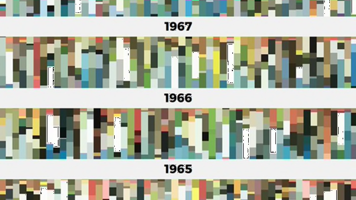
Using an algorithm, Rougeux analyzed the top five colors represented in every cover illustration and created a color palette for that issue. Then, he mapped out a palette for every single cover, creating a timeline of New Yorker design. It allows you to see what colors have dominated particular years and decades. If you scroll over the individual palettes, you can see the full image of that week’s cover.
Rougeux found some trends in the colors that have repeatedly graced the magazine’s cover. “Limited and muted palettes were used the 1920s," he writes on his site, while "possibly due to printing limitations, darker greens were more common in the 1940s, lighter palettes were used in the 1970s and 1980s, louder contrasting palettes were popular in the 1990s and more well-rounded palettes started being used since the 2000s.”
You can explore the color timeline for yourself here.
All images courtesy Nicholas Rougeux