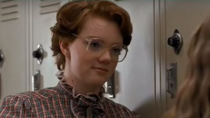
If you haven’t finished watching Stranger Things, turn back now. And if you have, and are still mourning Barb’s demise, the recently released concept art from Aaron Sims Creative won’t make you feel much better.
In a recent interview with Screen Crush, Sims shared some of the original concept art he and his team created for Stranger Things, including designs for the Demogorgon, the Upside Down, and those mysterious eggs Hopper discovers in the finale. He also shared some pretty horrifying concept art for the death of fan favorite character Barb.
The two illustrations show Barb’s death as the directing duo, the Duffer Brothers, originally imagined it. In the first illustration (which can be seen here), Barb lies on the ground with her ribs poking out of her chest. In the second, equally horrifying image featured below, a spider crawls out of her mouth. According to Sims, the first image was designed “to highlight the horrific aspects of Barb being eaten,” while the second directly followed the Duffer Brothers’s original version of the script. “In the script for that episode, there was specifically a description of a spider coming out of her mouth, which we incorporated into the design of that second shot,” Sims explained. “We don’t really have an explanation for its existence; the design is based around the script’s description.”
In the end, Sims and the Duffer Brothers came up with a slightly less graphic—though no less traumatizing—way to portray Barb’s demise. But it wasn’t because they felt they’d gone too far. “In the final design, they ended up veering away from that because it became too unrecognizable,” Sims explained. “It was difficult to tell exactly what had happened to her; it wasn’t an issue of it being too graphic, but rather, that the viewer needed to see something that was very recognizably dead.”
[h/t Screen Crush]
Know of something you think we should cover? Email us at tips@mentalfloss.com.
