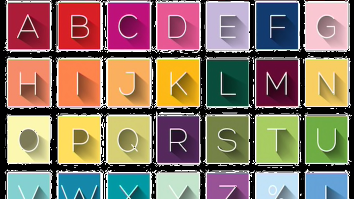
What's the difference between a font and a typeface?
A typeface is the collective name of a family of related fonts (such as Times New Roman), while fonts refer to the weights, widths, and styles that constitute a typeface (such as Times New Roman Regular, Italic, Bold, etc.). Not all typefaces consist of multiple fonts however.
Most people use the terms "font" and "typeface" interchangeably, and they are incorrect to do so. In most instances when people refer to fonts, they really mean typefaces. The confusion arose due to the prominence of digital fonts and naming conventions in operating systems, which refer to fonts rather than typefaces. Even type foundries tend to refer to themselves as font foundries rather than type foundries. As such there is a conflation of terms, where people think fonts are really digital typefaces, whereas typefaces are physical. Instead, the naming convention is the same for physical and digital typefaces; fonts refer to weights, widths and styles, and typefaces are the collective names of sets of related fonts.
Here are the naming conventions of fonts:
Weights: Hairline, Thin, Ultra Light, Extra Light, Light, Book, Regular/Roman, Medium, Semibold, Bold, Extra Bold, Ultra Bold, Black, Ultra Black. Widths: Compressed, Condensed, Semi Condensed, Narrow, Normal, Extended, Extra Extended, Expanded. Styles: Roman, Italic, Cursive, Oblique (a slanted roman), Small Caps (usually included as an OpenType feature rather than a digital font), Petite Caps (rare), Upright Italic (rare), Swash (usually an OpenType feature rather than a font). Optical sizes: Caption, Text, Subhead, Display, Deck, Poster. Grades: Grade 1, Grade 2, Grade 3, Grade 4 (subtly different weight to accommodate for different printing conditions). Effects: Inline, Outline, Shadow, Fill, Bevel.
A typeface is sometimes referred to as a font family, and in CSS this terminology is used rather than typeface. There are also type families however, which are related typefaces, usually covering sans and serif, and sometimes slab serif or even a blackletter design. Examples of type families are:
Brix Sans/Brix Slab/Brix Slab Condensed Museo/Museo Sans/Museo Slab/Museo Cyrillic/Museo Sans Cyrillic/Museo Sans Rounded/Museo Sans Condensed/Museo Sans Display Scala Sans/Scala Skolar/Skolar Sans
The strange thing about widths is that they are often presented as distinct typefaces rather than fonts that are part of one typeface. This is because different widths are often later releases to the original cut. For the same reason sometimes optical sizes are introduced as separate typefaces as well.
Typefaces for languages that use different scripts than Latin (Greek, Cyrillic, Hebrew, Arabic, Devanagari etc.) are referred to as typefaces rather than fonts.
Interestingly enough, historically, the distinction between typefaces and fonts was blurry in the first years of letterpress printing. Rather than a different style, italics were initially distinct typefaces used to set entire books in. These italics had upright roman capitals, as seen below in an italic type by Ludovico Arrighi, c. 1527.

It wasn’t until the middle of the 16th century that the popularity of italic type declined until italics fulfilled a secondary function of use for in-line citations, block quotes, preliminary text, emphasis, and abbreviations. It was then that italic types became fonts of typefaces rather than typefaces in their own right. Although, there is nothing against an italic type which features no other fonts to be referred to as a typeface.
This post originally appeared on Quora. Click here to view.
