With its convoluted history and ever-shifting borders, the Middle East isn’t an area that can be easily understood through words alone. Vox’s Max Fisher recognized this and compiled a treasure trove of maps that help explain the region's geography, its complex demographics, and the current political climate. We’ve included a few of them below (click the links below each to expand), but head over to Vox if you want to check out the whole list in full.
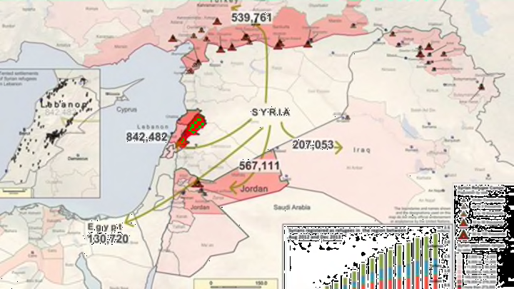
1. THE SYRIAN REFUGEE CRISIS
Thanks to the country’s Civil War, millions of Syrians have fled to refugee camps in neighboring Middle Eastern or European countries. This map shows the refugees—but as Vox points out, it doesn’t depict the millions of Syrians who are displaced within their own nation.

2. THE MIDDLE EAST'S MANY ETHNIC GROUPS
While the majority of individuals in many Middle Eastern countries are Arab, the region has ethnic and religious diversity to spare. In this map, Arabs are represented in yellow, Jews in pink, Turks in green, Persians in orange, and ethnic Kurds in red.

Michael Izady // Columbia University // Click to Expand
3. AN IMPERIAL HISTORY OF THE MIDDLE EAST
This animated video illustrates the rise and fall of the Middle East’s major ruling empires over the past 5000 years.
[h/t Vox]
