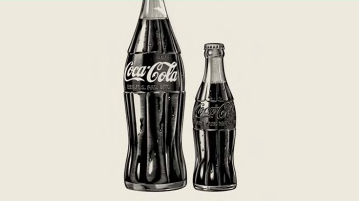
With its fluted glass and shapely design, the classic Coca-Cola bottle is a worldwide icon. Even without the label, you can immediately identify it with the brand—which is exactly what Coca-Cola wanted.
When the drink first hit the market in the early 20th century, Coke was sold in standard, straight bottles that were either brown or clear. While each one was embossed with the logo, that didn’t stop imitators like Koka-Nola, Ma Coca-Co, Toka-Cola or Koke from simply mimicking the design to such effect that they often duped consumers. By 1912, Coca-Cola had had enough. They needed a foolproof method for identifying and authenticating their product. Harold Hirsch, the company’s lead attorney, urged bottlers to develop a better container:
“We are not building Coca-Cola alone for today. We are building Coca-Cola forever, and it is our hope that Coca-Cola will remain the National drink to the end of time. The heads of your companies are doing everything in their power at considerable expense to bring about a bottle that we can adopt and call our own child, and when that bottle is adopted I ask each and every member of this convention to not consider the immediate expense that would be involved with changing your bottle, but to remember this, that in bringing about that bottle, the parent companies are bringing about an establishment of your own rights. You are coming into your own and it is a question of cooperation.”
Yeah, they took this mission very seriously. With a $500 initiative, a handful of glass companies across the U.S. were asked to develop a distinctive bottle, and the Root Glass Company in Terre Haute, Ind., ultimately crafted the winner. Under the direction of Alexander Samuelson, a Swedish glass blower, the team created a bottle inspired by an illustration of a cocoa bean with its elongated shape and grooves. A patent for the design was granted (notably without the Coca-Cola lettering as a means of protect the client) and selected by the company soon after.

The initial contract called for the bottles to be colored with “German Green,” which was later changed to “Georgia Green” as a nod to the company’s state of origin. It also specified that the glass weigh no less than 14.5 ounces. When filled, a bottle of crisp, refreshing Coca-Cola weighed over a pound.
As with any custom design, the new containers weren’t cheap and many bottlers hesitated at first, but as national ad campaigns started to roll out, the design eventually took over. The patent was renewed on Christmas Day in 1923, and the date on the side of the bottle was changed to December 25, 1923, which earned it the nickname, the “Christmas Bottle.” In 1951, the bottle was given Trademark status.

United States Patent and Trademark Office
The design has undergone minor alterations throughout the years and at different times has been called the “hobbleskirt” bottle (a nod to a popular, early 20th century fashion) and the “Mae West” bottle because of its curves. And while we rarely drink out of glass bottles anymore, the unique 100-year-old design is still as recognizable as ever, just as intended.
[h/t Boing Boing]
