Designing a good transit map is more complicated than it looks. Consider iconic designer Massimo Vignelli’s 1972 map of the New York City subway: Designed to be easily read at a glance, the map distorted above-ground geography to present a linear, simplified look at rail connections and destinations. And people hated it. Vignelli’s map was replaced with a more geographically accurate map in 1979, one that was closer to what people imagined the city looked like, but harder to read.
London’s transit mapping evolution has taken the opposite approach. Transport for London’s map of the London Underground [PDF] is a sleek, minimalist diagram of where the city’s subways intersect—and it looks nothing like the city itself. The Thames ends up looking like a game of Snake.

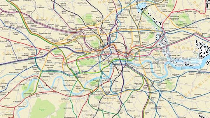
In response to a Freedom of Information request from a man named James Burbage, TfL created a new version of its London Underground map that shows exactly where the Tube runs, and how far apart the stops are. Unlike the current map, it shows where the subway runs in relation to parks and bodies of water. Now Londoners can see exactly how far across the city they travel each day (and how far it would really be to walk through the subway tunnels, as one architecture firm has proposed for the Circle Line, seen above in yellow).
This is what the city center looks like from a geographically accurate perspective:

The original TfL map may be easier for planning a subway trip, especially for out-of-town visitors who might get lost in the tangled rail lines that wind through the cluttered new map, but the geographically accurate version has the advantage of showing where the subway runs in relation to above-ground destinations—providing a whole new perspective for Tube veterans and newbies alike.
See the full map here.
[h/t: The Telegraph]
All images from Transport for London
