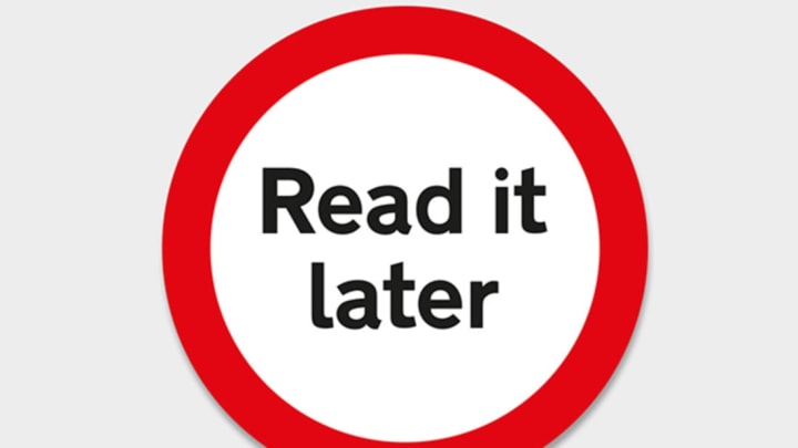
We often think of road signs as immutable designs. How else would a stop sign look? But someone had to come up with those iconic shapes. The UK is celebrating its 50th anniversary with its current system of road signage, created by Margaret Calvert and Jock Kinneir. The pair created new typefaces and standardized all the graphics for roadways across Britain in 1965.
In honor of the occasion, the British Road Sign Project asked notable artists and designers to rework the circles, triangles, and squares of UK traffic signage. These designs, according to the project website, move away from “instructing people of speed limits and directions to poetically disrupting our everyday with designs that makes us stop, look and think about design and our environment in a slightly different way; less instructions and more pauses for thought.” The sign above, for instance, urges people to put down their devices and look around.
These signs, on display at the Design Museum in London until October 25, are more playful than utilitarian. They would certainly cause an accident or two if motorists actually had to decipher them on the fly. But they provide a fun way to rethink ubiquitous, familiar objects from the urban landscape. We see street signs so often that they’re hard to notice, but these designs are impossible to ignore.

Image Credit: Ben Kelly
Ken Kesey’s psychedelic road trip in the summer of 1964 took place in a bus called “Further.”

Image Credit: Henrik Kubel
Which way should you go?

Image Credit: Amelia Noble
Amelia Noble turns standard warning graphics into something more lyrical.

Image Credit: Graphic Thought Facility
Street sign or bird illustration?

Image Credit: Mark Bonner / GBH
It's my way or...

Image Credit: Spin
Warning: luchador masks ahead.
See more artistic takes on the road sign here.
