One hundred years ago, Coca-Cola asked the Root Glass Company to design a glass bottle that would be recognizable even if broken on the ground or touched in total darkness. The result—known as the hobble skirt bottle because of its similarities to the narrow hemmed skirt—was patented in 1915.
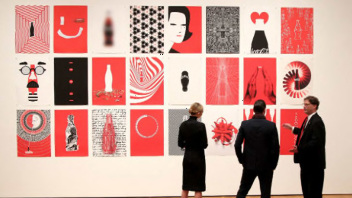
To celebrate the centennial anniversary of the classic bottle, the Coca-Cola company created the #MashupCoke challenge, calling on the global art community to reinterpret Coke iconography. Over 130 artists responded, and some of the works will be featured in "The Coca-Cola Bottle: An American Icon at 100" exhibit at the High Museum of Art, Atlanta, as well as in a traveling exhibition called "The Coca-Cola Bottle Art Tour: Inspiring Pop Culture for 100 Years." Some will also be featured in a limited edition book and on the Mashup Coke Instagram
James Sommerville, Coke's vice president of global design, described his vision for the project, saying that the company wanted to juxtapose some of the older iconography by famous artists—like Andy Warhol—with newer interpretations from unknown or emerging designers. "In theory, one is almost priceless and the other is technically worthless today, yet they are both equally rich and inspirational," Sommerville said. "And, who knows … maybe one day the unknown piece could become priceless. We could be hanging several future Warhols in the exhibition."

Image Credit: Stefan Kjartansson, Armchair Media (USA)
What do you see when you look at the image above? Stefan Kjartansson called the shape above the bottle a double conundrum because, depending on how you look at it, it's either lips or a heart.

Image Credit: Brian Steele, Sarah Moffat, David Turner Duckworth (USA)
The Turner Duckworth Design agency has been working with Coke since 2006. The team helped the brand simplify and modernize their image by creating what the statement on their website refers to as the "iconic 'kit of parts': Red, white, the Script, Dynamic Ribbon, Contour Bottle, Disk and Gotham typeface."

Image Credit: Deklah Polansky, Coca-Cola Design (USA)
Coca-Cola wasn't celebrating the anniversary alone. Surface Magazine also honored the famous bottle by instructing 12 designers to create an interpretation of the original bottle that could still hold and dispense Coke.
While most of the concepts incorporate a variation on bottle's famous contours, three of the designers went and invented something totally unexpected.

of New York City "wanted to produce a form that not only reflects the historical references of the past, but also symbolizes movement toward the future." To do so, he added the script logo to the steel-base and "exaggerated" the original 1915 curvature.

New York City-based designer Leon Ransmeier's design isn't a bottle at all. To reduce packaging waste, he designed a "super concentrated carbonated lozenge" that when dropped in 16 ounces of water, effervesces into a glass of Coke. Ransmeier explained that the tablet is "roughly the same diameter as a traditional bottle cap" and "simultaneously references both candy and medicine, raising interesting questions about health and soft-drink consumption.”

Image Credit: Surface Magazine, Facebook
Also not a bottle, Nolen Niu's Coca-Cola Siphon plays off of the original soda siphon of the 1800s; they were used to prevent carbonated beverages from becoming flat. His design has a "thumb stop above the dispensing button (to insure stability and control when serving)," and has a nozzle and button "reminiscent of a fountain gun." To use the siphon, the drinker can "uncap the bottle, screw into place the siphon, gently shake the bottle a few times (to allow the carbonation to build up), and then press the button on the back of the handle to dispense the Coke."
[h/t PSFK]
