We’ve seen how graphs lend themselves to humor in flowcharts, pie charts, and various other data visualizations. Once we featured a very few scatterplots in a list of humorous graphs, but this is the first list totally devoted to the form. If any of the following graphs are too small for you to read, follow the links to their original.
A scatterplot, or an XY chart, measures two different variables along the dimensions of the chart, and data points are plotted along those axes where they belong. Sometimes the pattern of plot points indicates a positive or negative correlation, and sometimes it indicates that there is no relationship between the two variables. Still, scatterplots sort and classify data points. And internet humorists love to sort, classify, and list things.
1. The Role of Luck in Game of Thrones

A chart from Buzzfeed plots the characters on Game of Thrones according to the evilness (horizontally) and their luck (vertically). The overall point is that there are a lot of characters in the series, and the lower right quadrant is the least populated, meaning that evil characters rarely encounter their deserved karma.
2. Fashion Guide

College Humor is not above explaining clothing to you in elementary terms. You can be comfortable or look good, or both, or neither, depending on what you pull out of your wardrobe. Not surprisingly, the uniform of the young American male is both. Most of the time.
3. The Matrix of Captains

Pop culture is full of captains, from Crunch to Picard. Dorkly plotted a bunch of them according to their leadership competence and dangerousness in a fight. As you can see, neither has any bearing on achieving that rank. For that, we can thank Captain Obvious.
4. Reasons for Cleaning My Apartment

The Commuter Challenge once asked for diagrams that included a mention of mineralogy. One of the winners was Brian Raiter, who made a scatterplot about cleaning his apartment. He said,
My second entry is the sort of thing that one occasionally sees on websites like graphjam, and it’s mainly just a bit of silliness. I hasten to point out that the graph is hyperbolic for the purposes of humor; it does not really describe me accurately! I’ve never had an ex-girlfriend visit me.
I never did find a reference to mineralogy. I don't think that matters now.
5. Pancakes

Here’s a scatterplot of pancakes. It shows a fairly positive correlation, because the axes are logically related. Basically, it’s what goes through the mind of the cook while making pancakes.
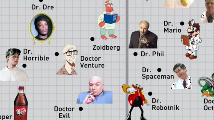
6. Pop Culture Doctors

Movies and TV are full of doctors. That doesn’t mean they are at all competent, because you don’t get drama from perfectly functional professionals. And they aren’t all medical doctors, anyway. College Humor selected a range of doctors and ranked them on the variables of education and training,and whether you can trust them to save your life. Many are highly trained, but half of the best-trained doctors are likely to let you down.
7. Your Favorite Mad Scientists

As a matter of fact, several pop culture doctors can be termed “mad scientists.” Any character described as a mad scientist starts out both trained and unbalanced, but they vary greatly along the dimensions of madness and brilliance. Dorkly plotted them as such. Aren’t you glad these folks are fictional?
8. The Meryl Streep Matrix

Meryl Streep is one of the most acclaimed actresses ever, and the number of movies she’s done is staggering. She’s also very versatile, and her characters prove it. Vulture took 29 very different Meryl Streep movies and plotted her characters in them according to warmth and seriousness to show how one person can be all over the map when she knows acting better than anyone.
9. Mysteries

Randall Munroe of xkcd fashioned a scatterplot graph to compare mysteries in both their overall weirdness and their explainability. However, people will still argue over what the explanation is. Most people look at the Loch Ness Monster mystery and say “pareidolia,” while a few others just know there are dinosaurs in the lake. The makeup of the graph will change over time. Some day, the case of Malaysia Airlines Flight 370 will swing from the upper right to the lower middle.
