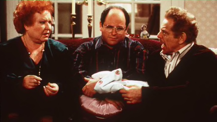
There’s a reason that most sitcoms, from Seinfeld to Friends to The Big Bang Theory, all look similar. That familiar bright aesthetic can be traced back to one man, according to a recent video explainer produced by Vox. This pioneer, explains Vox’s Phil Edwards, was none other than Karl Freund, the cinematographer behind the pioneering 1927 sci-fi film Metropolis and the 1931 Bela Lugosi version of Dracula.
Freund would go on to work on I Love Lucy, essentially inventing the three-camera sitcom, a form that’s still recognizable today, though you might not be able to put your finger on why.
It basically came down to the much-derided laugh track. Sitcoms like I Love Lucy were shot in front of live audiences, which Freund argued brought out better performances. But in order to have a show that didn’t need to pause to re-stage shots or move lights around, filming had to happen in a specific way. Freund helped solve that problem.
He set up three cameras, one on each side of the stage to capture close-ups, and one in the middle to capture wide shots. These cameras were on moving dollies that allowed them to shift. Even more crucially, the set had fixed lighting. There were lights placed above the set, down on the floor, and under the cameras. Actors were brightly lit from every angle so that shooting never had to stop. Actors could move around the set as much as necessary, and the cameras could follow them.
That even lighting is why sitcoms all have that bright look. Movies and single-camera shows, by contrast, are more dramatically lit, with dark shadows and a tighter camera focus. Film directors can play with lighting and focus as much as they want, while a studio audience watching a sitcom wouldn’t have much patience for all those cuts—nor would a tight shooting schedule for a weekly sitcom like I Love Lucy have room for them.
See the difference in the video below.
[h/t Digg]
