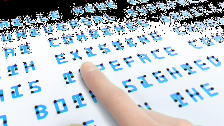
Braille wasn't designed to be seen or heard. For vision-impaired people already fluent in the language, this isn't a problem: Running their fingers across a page or a sign can give them valuable information they wouldn't know otherwise. But for a sighted person interested in learning the language, all those tiny identical dots can look a bit intimidating. Now Co.Design reports that Japanese designer Kosuke Takahashi has reimagined braille as text that's meant to be seen as well as touched.
His typeface, called Braille Neue, has two versions: one for Japanese characters, and one that works for both Japanese and the Roman alphabet. The lines in blue represent the written text. Someone who uses their eyes to read can decipher the meaning of a letter from looking at that component alone. Each character is also marked with one or more black dots; this represents the letter in braille. A vision-impaired person can feel the raised bumps to read it like they normally would, while a sighted person can easily see which braille patterns correspond to which characters.

Takahashi isn't the first designer to overlay text and braille, and he doesn't plan to be the last. He hopes his project will inspire more people to improve on his project and create braille typefaces of their own. "Through the contribution of increasing the variation of typeface that combine braille with existing characters, I believe we can create an inclusive society where using braille becomes commonplace," Takahashi tells Mental Floss.
Braille Neue is just a concept for now, but Takahashi sees it one day replacing current signs that display braille and text separately. In the short term, he envisions the typeface being used at the 2020 Tokyo Olympic and Paralympic Games.
[h/t Co.Design]
