8 Infographics That Show the Visual Power of Circles

The Book of Circles: Visualizing Spheres of Knowledgeis a compendium of circular infographics and designs created throughout centuries.
Though you may not realize it, humanity is obsessed with circles. “Used to represent a wide range of ideas and phenomena pertaining to almost every domain of knowledge, the circle [has become] a universal metaphor embraced by virtually every civilization that has ever existed,” information designer Manuel Lima explains in his latest book, .
Lima—whose last book, , explored the world of tree diagrams—uses more than 300 illustrations, photos, and infographics dating from present day all the way back to the 10th century to show just how ubiquitous this simple shape is in design, and just how long humans have been fascinated by it. If you look, you can see the circular form almost everywhere, he writes, “... from the towns and urban areas we have built over the centuries to the household articles and tools we have designed to the written signs and symbols we have created to communicate with each other.”
Take a look at some of the architectural, artistic, cartographic, and data visualization examples Lima highlights in the book:
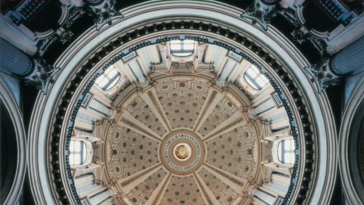
1. DOME OF THE BASILICA OF SUPERGA, TURIN, ITALY
Humans have been building in circular shapes for millennia. This particular basilica dome was built between 1717 and 1731.
2. COMPACT MUON SOLENOID, LARGE HADRON COLLIDER, CESSY, FRANCE, 2008
"[Circles] became a chief guiding principle of human culture, emulated and reinvented in art, religion, language, technology, architecture, philosophy, and science," Lima writes. Compare the design of the Large Hadron Collider's Compact Muon Solenoid particle detector with the Basilica of Superga's dome, built centuries apart.
3. ANDREW KUO: MY WHEEL OF WORRY, 2010
In 2010, artist Andrew Kuo created this radial chart to illustrate the personal thoughts that plague him. The outer ring represents the thoughts he has while scratching a lottery ticket; the middle ring, the things he thinks about while looking at his credit card statement; and the innermost ring, the topics that he worries about while trying to fall asleep. Each of the 24 thoughts is assigned a particular color, as detailed in the list at the bottom of the chart.
4. LOLA MIGAS AND RYAN DIAZ, CHROMAPOEMS: I HAVE A DREAM, 2010
This diagram represents Martin Luther King Jr.’s “I Have a Dream” speech. Every block of color is a word, and every ring a paragraph. It comes from "Chromapoems", an infographic series that analyzes the language used in different examples of poetry and prose.
5. JAEHO LEE, DONGJIN KIM, JAEJUNE PARK, AND KYUNGWON LEE, FLOW CIRCLE: CIRCULAR VISUALIZATION OF WIKI REVISION HISTORY, 2013
These designers used Flow Circle—a software tool they developed to visualize how Wikipedia pages change over multiple edits—to explore how the page for “gun politics” has changed over time. The diagram is based on screenshots of the page over time, tracing relationships between the authors (listed along the outer edge) and their edits. The original version is interactive, so you can scroll through the text of the Wikipedia page and click on the colors within the image to highlight the specific words that were added or subtracted in that edit.
6. VALERIO PELLEGRINI, GIORGIO CAVIGLIA, GIORGIO UBOLDI, AND MICHELE MAURI (DENSITYDESIGN): CHARLES DICKENS, 2012
This infographic maps the linguistics in the work of Charles Dickens—specifically Oliver Twist, A Christmas Carol, David Copperfield, Great Expectations, and Little Dorrit—in their Italian editions. The names of the books line the outer edge of the circle, with smaller bubbles inside representing certain words. The words are laid out so that the more that they’re used in a particular book, the closer the bubbles appear to that work along the circle. The size of the bubble represents how often that word is used in all of the books, and the weight of the lines is determined by how often the connected words appear together in a sentence.
7. JI SOO HAN AND PAUL ORNSBY: SITUATIONIST DRAWING DEVICE, 2010
The Situationist Drawing Device is a machine worn like a backpack that tracks the movements of the wearer. Designed to reorient the user’s perception, refractors hang in front of the machine to distort your vision, reversing the images seen by your left and right eyes. During the dizzying experience, the machine records your movements with a seismograph.
8. PIER GUSTAFSON: 21 LEE STREET AND ENVIRONS, 2009
Calligrapher and artist Pier Gustafson used pen and ink to create this intricate bird’s eye view that centers on a specific house—21 Lee Street—in Cambridge, Massachusetts. If you look closely, you can see intricate details like a crew team on the Charles River and a home run hit flying out of Fenway Park.
The Book of Circles: Visualizing Spheres of Knowledge comes out on May 2. You can pre-order it on Amazon for $25.
All images courtesy Princeton Architectural Press