6 Little-Known Maps by the 19th Century's Most Famous Infographic Designer

Charles-Joseph Minard's map of Napoleon's invasion of Russia has been called the best statistical graphic ever created
You may not know his name, but if you’re a fan of infographics, you’ve probably come across Charles-Joseph Minard’s work before. The 19th century French civil engineer is responsible for what statistician and data visualization expert Edward Tufte has deemed “the best statistical graphic ever drawn”: a flow map of Napoleon’s doomed 1812 invasion of Russia. (Tufte also sells a poster version of it.) The "Napoleon’s March to Moscow" map, published a year before Minard’s 1870 death, may be the singular work that has made the engineer famous to a contemporary audience of data visualization nerds, but it was the culmination of a long career developing an oeuvre of similarly detailed visualizations. A new book, The Minard System: The Complete Statistical Graphics of Charles-Joseph Minard, highlights the many lesser-known infographics Minard created throughout his career. Here are six little-seen Minard visualizations from the book.
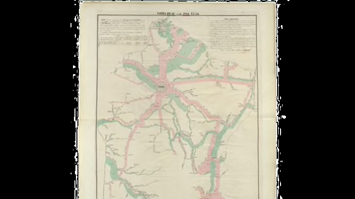
1. Circulation of Goods on French Railroads and Waterways in 1856
Minard didn’t set out to become a design icon—drawing and mapping was part of his work as an engineer. He was particularly interested in economics, and sought to communicate the value and use of new infrastructure investments. He worked in France’s public engineering corps, then became a professor and inspector; it wasn’t until he retired in 1851, at 70 years old, that he began to pursue his passion for statistical mapping in earnest.
2. Transport of Mineral Fuels in France in 1858
Though he didn’t invent the form, Minard is best known for his use of flow maps, which show the migration of people, goods, or other data points between locations—say, the flow of French troops marching (in increasingly smaller numbers) to Russia. He created 41 large-format maps in this style throughout his career, beginning in 1845, when he created one to study road traffic (which represented potential demand for a future railroad) between his hometown of Dijon, France, to the nearby city of Mulhouse. The map above was part of a years-long series he did on the transport of fuels throughout France, color-coding the flows according to the country where the fuel came from.
3. Circulation of Goods on French Railroads and Waterways in 1861
Minard published several series of maps on the same theme, tracking the data as it changed throughout the years and publishing updates. This series, for instance, consists of 10 different maps on the fluctuations of freight shipping along waterways (in green) and railroads (in pink) in the 1850s and early 1860s.
4. European Cotton Imports in 1858 and 1861
During the U.S. Civil War, Minard began charting how the world cotton trade would be affected by the country's potential split. The blue flow represents cotton exported from the U.S., while the orange flow represents cotton from India, the brown represents cotton from the Middle East, the purple represents cotton from Brazil, and the faint pink represents cotton purchased by England and then re-exported to Europe. As the war went on, Minard's series showed how U.S. politics had rapidly reshaped the global economy.
5. European Railroad Travel in 1862
In most of his infographics, Minard included a detailed written explanation of the data, noting his data sources, calculation methods, and brief analysis. A single visualization could draw on any combination of published data, government statistics, and correspondence with officials and other engineers involved in the field. To gather data for this map of railroad traffic, he consulted parliamentary minutes, reports by the Spanish Ministry of Public Works, official documents from the General Assembly of Railroad of Southern Austria and Lombardy, travelers's receipts, and more.
6. Dissemination of Ancient Languages
Minard wasn't associated with any particular scientific group, and he published all his maps himself. However, he did have longstanding connections in France's infrastructure corps, and he received some encouragement from public works administrators and other officials. His maps were presented to Emperor Napoleon III and various other French statesmen, who received them favorably, and a number of people subscribed to his maps, including administration officials, economic researchers, and businessmen involved in infrastructure projects. He also inspired others in France's civil engineering circles to publish their own detailed diagrams and maps, popularizing statistical graphics in his time.
The Minard System is available on Amazon for $37.