If you happen to exist in that special subsection of the Venn diagram between typography nerds and sci-fi nerds, Dave Addey is your man. As reported by Boing Boing, he writes Typeset in the Future, an entire website devoted to the lettering seen in the intertitles and backgrounds of futuristic films.
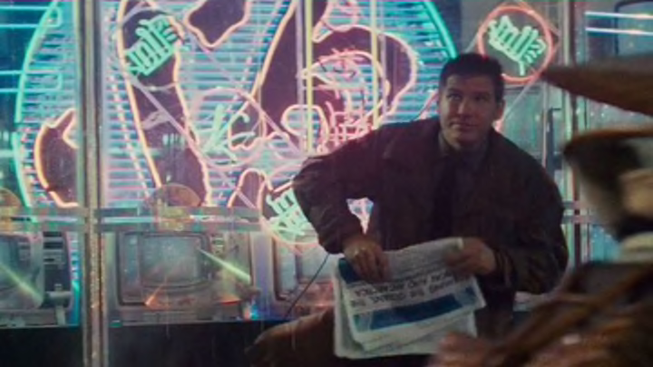
In his latest project, Addey dives into Blade Runner (1982), Ridley Scott’s beloved tech noir. Have you ever wondered what typeface can be seen in a folded newspaper that Rick Deckard is holding? Of course! It’s likely Futura Demi. What about the sign that hangs over the entrance to the Bradbury Building in Los Angeles? Unlike the real sign, in the movie, it’s Berthold Block Heavy.
Blade Runner isn't the only film that's gotten the type nerd treatment. Addey has previously taken a look at movies like 2001: A Space Odyssey (1968) and Alien (1979). You could spend hours exploring every minute detail of each of these films’ set and prop design—as Addey certainly has—digging deep into everything from the lettering featured on photographs characters flip through to how often-filmed locations like the Bradbury Building are redesigned for different movies.
[h/t Boing Boing]
Know of something you think we should cover? Email us at tips@mentalfloss.com.
