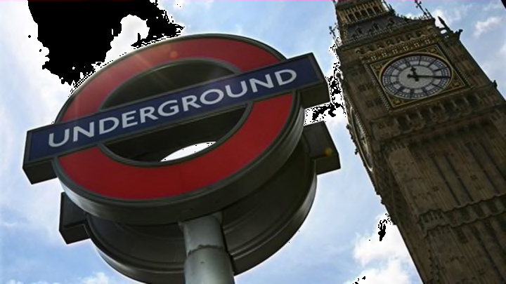
The London Underground Updates Its Iconic Signage With a New Typeface

The London Underground’s signage is one of the most recognizable symbols of the city. This year, it’s getting a major facelift in the form of a new typeface, WIRED reports.
It’s been 100 years since the Johnston font (designed by renowned calligrapher Edward Johnston) first appeared on the London Underground, and the look on Transport for London’s signage has changed over time. The designers at Monotype, who were tasked with updating the typeface, wanted to reinvigorate the Tube experience with a little more joy than the utilitarian shapes of the current typeface conveyed. Not to mention the new challenges that a 21st century transportation system faces: The look has to work on a phone as well as a poster. The hashtag did not exist a century ago, after all.
The difference is quite subtle, but you can compare the new design, below, with the 2008 photo above:
And this is what the new type will look like on mobile:
To create the typeface, the designers headed to the London Transport Museum and looked at old signage to compare proportions and other characteristics of the typography. Their new take on Johnston, called Johnston100, is wider, giving readers the “luxury of space,” as Monotype director Nadine Chahine refers to it in the video below. There are now five weights of the typeface (including two very thin iterations) and certain quirks in Johnston’s original designs, like an unusually shaped “g,” have been reintroduced.
Introducing Johnston100 for TfL from Monotype on Vimeo.
“It’s not about being mechanical and perfect,” Chahine said. “It’s about accepting it in all of its quirky little details.”
The new design will be rolled out in July, starting with maps and posters before eventually being incorporated into train and station signage.
[h/t Wired]
All images courtesy Monotype via Businesswire unless otherwise noted.