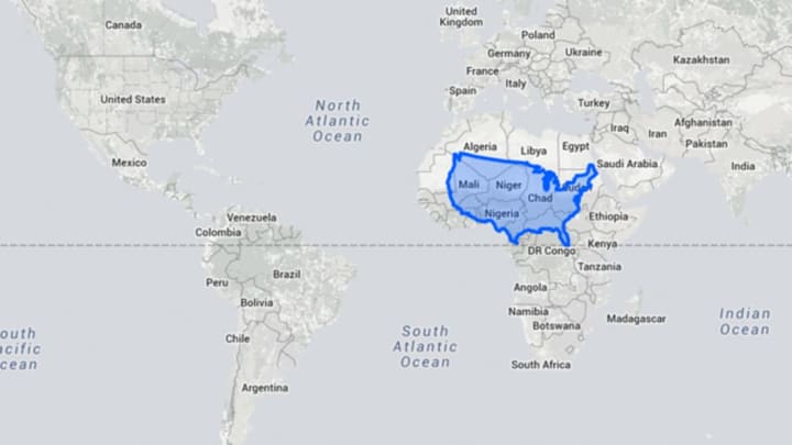
If you grew up thinking Greenland was bigger than India, or that Alaska was the size of Brazil, you probably learned geography from a Mercator map. Originally created in the 16th century for sailors, the immensely popular Mercator map eventually made its way into 20th century elementary schools, where, for decades, it left all of us confused about the relative sizes of countries around the world.
Fortunately, if you’re still befuddled by the sizes of our planet’s land masses, there’s now a simple way to rectify that. WIRED reports that a new web app called The True Size Of, created by James Talmage and Damon Maneice, makes it easy to see how big different countries are and lets you compare them to their distorted representation on the Mercator projection.
The app, which was inspired by an episode of The West Wing, lets users drag the outline of any nation around on the Mercator map to see how it really compares to other countries. For instance, as you drag Greenland south on the map, its outline begins to shrink, while dragging countries closer to the equator far into the northern or southern hemisphere makes them grow.
“Every map projection introduces distortion, and each has its own set of problems,” Talmage and Maneice explain on their website, “We hope teachers will use [The True Size Of] to show their students just how big the world actually is.”
[h/t WIRED]
