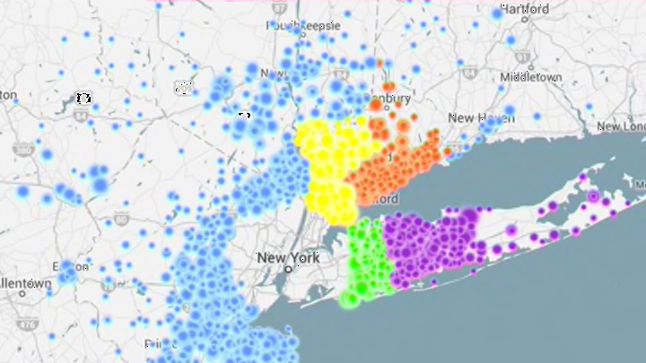
Depending on where in the United States you live, daily commutes can range from mildly annoying to genuinely soul-crushing. In order to visualize how far workers travel to get to work each day and the routes they take, Mark Evans has created an interactive map of commutes across the United States.
WIRED reports that Evans decided to map out America’s commutes after seeing a visualization of commutes in the Bay Area. His Commute Map uses data from the US Census Bureau’s American Community Survey from 2006 to 2010 to expand the Bay Area project to every county in the United States. Using multi-colored dots to show how many people are commuting from different locations, the map shows just how far people travel for work (hundreds of miles in some cases) and gives a general sense of how congested traffic must be in some of America’s larger cities.
The Commute Map is an impressive data visualization, and there’s something beautiful, if strangely ominous, about watching all of those disparate multi-colored dots converge on a single point. It’s also a useful tool for anyone thinking about taking a new job in a new city or trading their cramped urban apartment for a more spacious house in a nearby suburb.
In a blog post, Evans explains, “The resulting animations are somewhat hypnotic (even my dog seemed to go into a trance watching them, leading to minutes of human amusement), but also provide a visual way of quickly seeing the distribution of workers into a given city.”
Check out the Commute Map here.
[h/t WIRED]
