How Causes of Death Change as You Age

Nathan Yau via FlowingData
As the Darwin Awards prove every year, there are infinite ways to die, whether by freak accident, rare illness, or commonplace scourges like cancer.
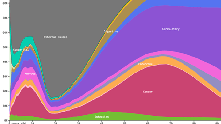
Statistician Nathan Yau mapped how the proportion of people who die from various causes changes across ages, using the CDC’s data on Underlying Causes of Death in the U.S. The height of each of the colored strips in the charts show, of the people who die at a certain age, what percentage die of each cause.
The visualization highlights what a high percentage of people die of heart attacks as they become senior citizens (the purple section is circulatory problems). It also shows how teenagers who die are more likely to die from external causes (such as an accident or murder) relative to many other causes.
The chart above is specifically male mortality, but Yau also graphed how women die across age groups, and how the proportion of death from certain factors changes based on race.
Causes of death for women
Note that this data is specific to Americans, and that mortality rates can differ substantially in different parts of the world. Some Eastern European countries have substantially greater mortality rates for heart disease than the U.S. does, so the proportion of circulatory-related deaths would likely be bigger there, for example.
The interactive graphic is much more comprehensive than the still images, so check it out here.
[h/t FlowingData]