Capital letters aren't just for starting sentences. Here are 15 more interesting ways to make use of them.
1. EMPHASIS
Internet vernacular uses all-caps for emphasis, often excitement or anger.
2. MONUMENTS
Our alphabet actually used to be all-caps, all the time, since the earliest written forms of Latin didn't have lowercase at all. That's why uppercase tends to be boxier: It's easier to carve straight lines in a monument, whereas lowercase is more rounded because that's easier to shape with a pen.
3. ESCALATING CAPITALIZATION
escaLATING CAPITALIZATION. you know, when you start out calmly in lowercase BUT THEN SOMETHING EXCITING HAPPENS.
4. GETTING STUCK IN AN ALL-CAPS WAR
You might have started out EMPHATIC, but sometimes that sticks around too long and you're left awkwardly shouting
WHY ARE WE STILL TALKING IN ALL-CAPS
I DON'T KNOW
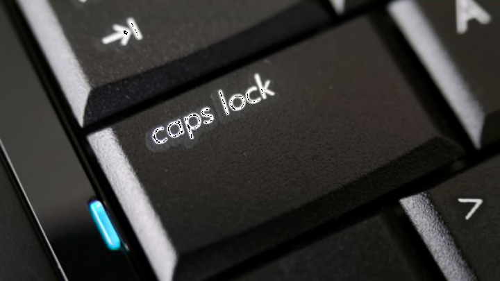
5. JOINING A SOCIETY FOR THE BANNING OF THE CAPS LOCK KEY
The caps lock key dates back to typewriters, when it was a lot harder to hold down shift for an entire word or phrase. With modern keyboards, people have proposed using its prime real estate for something else.
6. "STUDLY CAPS"
That possibly-retro style where you alternate caps with each word. Pair with sparkly unicorn punctuation.
~*~ cAuSe I gOt A bLaNk SpAcE bAbY ~*~ aNd I'lL wRiTe YoUr NaMe ~*~
7. CAMELCASE
CamelCase is the tamer cousin of studly caps, where you add a capital in the middle of a compound word to make it rise up like a camel's hump. Common in brand names (PowerPoint, MasterCard, LinkedIn) and speculative fiction (RejoovenEsence in Oryx and Crake).
8. CAPITALIZE ALL YOUR NOUNS
In standard English, we capitalize proper Nouns, but that hasn't always been the Convention. Until the 19th Century, English used to capitalize all Nouns, just like modern German still does. You can see this in old Documents like the Declaration of Independence.
9. IRONIC CAPS
Sometimes used with ™, ironic capitals indicate that something is a Very Important Idea.
10. ILLUMINATED MEDIEVAL CAPITALS
If you've got a lot of time on your hands, why not channel your inner scribe and adorn the capital at the beginning of your manuscript with a detailed illustration like this?
11. sᴍᴀʟʟ cᴀᴘs
Technically speaking, small caps are supposed to look slightly different from just capital letters in a smaller font. Real small caps are a little thicker and further apart than small-font capitals, to make them flow better with the rest of the text.
12. MONOPHABET
The monophabet is a proposal by Bradbury Thompson in 1958 for an alphabet with identical letter shapes for upper- and lowercase, where the size of the letter is the only thing that indicates whether it's capitalized or not. Hypothetically, it might have been easier to learn. In practice, it never caught on. Here's what it looked like:
13. USE THEM JUST FOR THEIR SHAPE
Words like U-turn, T-shirt, A-frame, A-line, and S-curve have nothing to do with the meaning of the letters. Lowercase letters don't tend to be used for their shape, whether that's because they have less evocative shapes or simply that they're more easily confused for part of the actual word.
14. NOT USE 'EM
omitting
capitals has
been an aesthetic
choice
for various writers
including poets
like
e.e. cummings
and
modern tumblr users
15. DON’T HAVE ANY
Most writing systems just don't have any equivalent for capitals. We're used to them, but they're really only a thing in orthographies based off the Greek alphabet—the Roman, Cyrillic, Coptic, and Armenian alphabets. Not so in other writing systems, including Chinese, Japanese, Korean, Arabic, Hebrew, Hindi, and more. To them, capitalizing letters would be about as weird as capitalizing numbers would be for us. "What do you mean a capital 6? It's just 6!"
