This Font Simulates What It's Like to Have Dyslexia

When graphic designer Daniel Britton shared his recent dyslexia diagnosis with his classmates at the London School of Communications, he was met with confusion, blank stares, and outright derision.
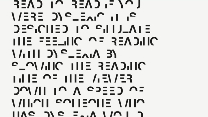
Realizing that there was no way for them to truly understand his struggle to make sense of letters, Britton decided to create a font—called “Dyslexia”—in order to give non-dyslexics a sense of what the learning disorder entails.
The designer tells Fast Company the font isn’t meant to depict exactly what a dyslexic sees when he or she picks up a text. “At least in the UK, awareness ads will represent text as seen by dyslexics as a bunch of blurry letters, or an upside-down letter form,” Britton says. “At least for me, that’s not what it’s like at all. It’s more like the text looks normal, but the part of my brain that decodes it just isn’t awake.”
Britton created Dyslexia by subtracting 40 percent of the lines from each character in the Helvetica alphabet. This renders the letters somewhat recognizable—but the overall effect means the brain must take its time picking out and stringing together formerly recognizable characters.
After showing his work to a few peers, Britton—who recently landed a job with a local dyslexia awareness commission—feels like he accomplished what he set out to do.
“When I showed it to classmates, they were suddenly like ‘Oh! Okay. I get it,'” he shares. “Which is all I needed to hear.”
See more of his work on his website.
[h/t Fast Company]