25 Things Hiding in Sports Logos

We've looked at hidden messages in corporate logos before. Here are some examples from the world of sports, some more obvious than others.
1. Quebec Nordiques
The now-defunct Canadian hockey team sported a red "N" next to a hockey stick. Together, the images created an igloo. There is a slim chance nostalgic Nordique fans might see their team re-emerge: Canada might add three more franchises in the next 20 years, and Quebec City meets the minimum requirements.
2. The Atlanta Falcons
The falcon's wing and out-stretched claws make the shape of an "F" for Falcons.
3. Dallas Mavericks
The intimidating horse has a subtle "M" on its forehead.
4. Hartford Whalers
Another defunct hockey team with a clever logo. The negative space between the "W" and the whale tail create an "H," for Hartford.
5. Milwaukee Brewers (1978-1993)
The "M" & "B" come together to form a catcher's mitt, complete with baseball in the center.
6. Houston Rockets
The "R" in the hoop is a rocket taking off. There's also a hidden "H" formed by the hoop and "R."
7. Montreal Expos
At first glance, this logo looks like an "M" in the colors of the French flag. A lowercase "e" and "b" are tucked into the "M." Officially, the letters stand for Montreal Expos Baseball. A popular theory says that the letters are actually "EJB," the initials of Elizabeth Bronfman, the daughter of a former Expos owner.
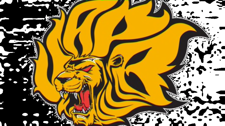
8. Arkansas–Pine Bluff Golden Lions
This lion gets its mane from the letters "UAPB," for University of Arkansas Pine Bluff.
See Also: Logo Mashups for All the Teams in Each City
9. Big Ten Conference
The "IG" in BIG is meant to look like a ten, so that two words fuse into one. Also check out Big Ten's logo when there were 11 teams involved.
10. Montreal Canadiens
The H inside the Canadien logo officially stands for "hockey," but some fans think it refers to the team's nickname, the "Habs."
11. Washington Capitals
The Washington Capitals tried to incorporate several patriotic elements into their alternate logo. An eagle and the Capitol Building come together to create a very American "W" for Washington.
12. Winnipeg Jets (1979-1990)
Hockey teams love hidden symbols! The "J" in the original Jets' logo is also a hockey stick.
13. Winnipeg Jets
After coming back to Winnipeg in 2011, the Jets got a new logo. There is a not-so-hidden maple leaf behind the jet. The notch at the top indicates north and is a wink at True North Sports & Entertainment, the company that owns the team.
14. Minnesota Wild
The Minnesota landscape makes up this logo’s bear shape. A setting sun fills its ear and a running river doubles as the bear’s mouth. Most interestingly, the eye is meant to be the North Star, a potential nod at Minnesota’s previous team, the Minnesota North Stars.
15. Colorado Avalanche
The snow/streak from the hockey puck that wraps around the "A" is shaped like a "C" for Colorado.
16. Michigan Stags
You may not know this short-lived WHA team, but for the short time they played, the Stags sported this deer on their sweaters. The legs make the shape of an "M" for Michigan.
17. Washington State Cougars
This fierce cougar from Washington State University is made up of the letters "WSU."
18. Arizona Diamondbacks (2007)
This alternate logo uses the letters "D" and "B" to create the image of a snake. The following year, pupils were added to the snake's eyes to make the image clearer.
See Also: 11 Hidden Messages in Company Logos
19. Minnesota Twins
The "win" in Twins is optimistically underlined.
20. Tampa Bay Rays
The home of DJ Kitty has a yellow light on the "R" to suggest that the Rays refers to both devil rays and rays of light.
21. Minnesota Timberwolves (1996-2008)
This alternate logo combines an "M" and a "T" to create the image of a wolf. Sorta.
22. Portland Timbers
The axe is also a "T" for Timbers.
23. New Jersey Devils
This one might be a little obvious to some people, but it took me forever to realize the devil takes the shape of "NJ" for New Jersey, and is not just striking a sassy pose.
24. Washington Wizards
The wizard's beard helps create the shape of a blue "W" for wizards. The outline of the basketball is also a crescent moon.
25. St. Louis Blues
The Blues logo does not have any hidden letters or shapes, but it possibly has a hidden meaning. The winged note bears a striking resemblance to a 64th note. St. Louis was founded in 1764. Unfortunately, this is not an official explanation, but a well-received fan theory.
Additional Sources: SportsLogos.net, TSN, The Roosevelts, and the Facebook group "Best Day of My Life: When I Realized the Brewers Logo Was a Ball and Glove AND the Letters M and B."