Charts and diagrams have long been used to help visualize various aspects of science, and vintage infographics provide a look at what learning was like a hundred years ago. Students could find these charming illustrations in textbooks, classroom posters, and even inside cigarette packs.
1. Decomposition of Light - 1856

Edward Livingston Youmans, the founder of Popular Science, penned a beautifully illustrated textbook called Chemical Atlas: Or, The Chemistry of Familiar Objects.The book holds a number of colorful and educational diagrams, and the original is worth a little over $3000. This illustration from the text shows how white light is refracted into the colors of the rainbow.
2. Progress of Animal Life - 1872

Trees live for a really long time, as shown by this nifty chart, which appeared in an old issue of Popular Science. It shows animal life flourishing alongside growing sequoias. The sections of a tree are shown with corresponding events in history, to illuminate how trunk size shows the passage of time.
3. From Fish to Man - (date unknown)

American Museum of Natural History
Lantern slides were introduced in 1849, and remained in classrooms for about a century. Before modern projectors and Smart Boards, they were extremely useful for visual learning. This slide shows "our faces from fish to man." The colors were added by hand using special tints. DISCLAIMER: This is definitely not an accurate representation of evolutionary biology.
4. Astronomy - 1929

A beautifully illustrated print of the planets, seasons, solstices, and other astrological elements. The text is in Spanish, despite the fact that the chart was published in Paris, France.
5. Optics - Mid 1800s

John Philipps Emslie illustrated a variety of diagrams, maps, and old-timey infographics. This particular diagram illustrates how eyes pick up and interpret light.
6. The Constellations - (date unknown)

A map of constellations is explained as "strange creatures you can see in the sky." This simplified map helped children learn the groups of stars without the Greek mythological terms. Ursa Major and Auriga are reduced to "The Great Bear" and "The Charioteer." Somehow, Perseus wasn't translated to "that guy who killed the snake lady."
7. Minerals - 1930s

Here is a handy guide for identifying select minerals. It comes from a book about minerals, gems, and precious stones.
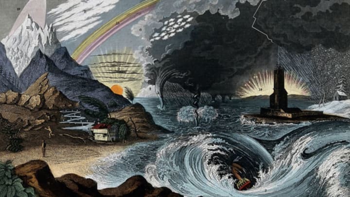
8. Meteorology - Mid 1800s

Here is another gorgeous illustration by John Philipps Emslie. This one focuses on meteorology.
9. Tides - 1935

When only soft-pack cigarettes were being made, manufacturers needed a way to keep the packaging stiff. Cigarette cards kept the pack rigid and featured anything from celebrities to race horses. Some even showed basic science diagrams—like the one above that features the different tides.
10. Environment and Locomotion in Mammals - 1943

American Museum of Natural History
This chart was featured in the May issue of the Natural History magazine. It shows how different animals get around in their environment. Check out how much air that jack rabbit is getting!
11. Chemistry of Combustion and Illumination - 1856

This diagram, also featured in Youmans' textbook, shows the structure of a flame. It illustrates atoms as colored squares to help students visualize the science behind fire.
