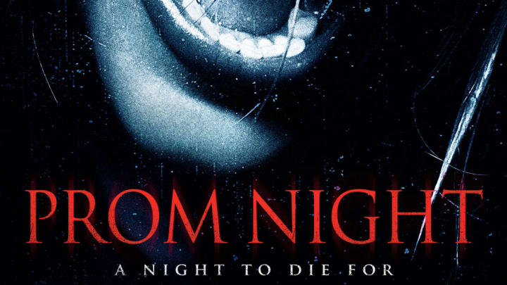
You may have never heard of Trajan, but you'd likely recognize it if you saw it. The typeface is ubiquitous in movie posters, appearing on ads for everything from prestige dramas to low-budget horror flicks. The video below from Vox explains how the seemingly simple serif design exploded into an industry cliché.
In 1989, inspired by the lettering at the base of Trajan's Column (a triumphal column that celebrates 1st century Roman Emperor Trajan), a designer named Carol Twombly created Trajan. It was used as one of the standard fonts in Adobe, whose software was just beginning to change how movie posters were made. In 1992, Trajan began appearing on movie posters, starting with one for Héctor Babenco's At Play In the Fields of the Lord. It wasn't long before it became the go-to font for poster designers looking to give their movies an epic feel with the options that were available on their computers.
Trajan hasn't become any less popular in recent decades, but the types of films it's used to advertise have started to shift. Instead of marketing dramatic films that premiere during awards season, it's now a common sight on the posters of B-movies and straight-to-digital/Blu-ray releases.
"A lot of posters are for the lesser movies that want to pretend they're better than they actually are," typography writer Yves Peters told Vox.
Thanks to the advent of computers and design software, movie posters look a lot different than they did during Hollywood's golden age. You can download thousands of vintage movie posters from the University of Texas at Austin’s Harry Ransom Center to see the difference.
[h/t Vox]
