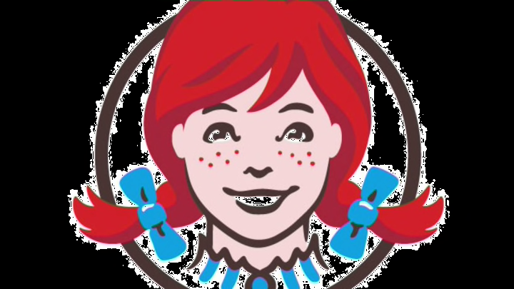
When Wendy's redesigned its logo in 2013, the company insisted the word "MOM" in the collar was unintentional. But plenty of other logos contain messages that were very much intended. Here are some examples, some more obvious than others.
1. The FedEx Arrow

The classic! As Matthew May said in The Laws of Subtraction, "Nearly every design school professor and graphic designer with a blog has at some point focused on the FedEx logo to discuss the use of negative space." I recently pointed out the arrow to my five-year-old daughter and blew her mind.
2. The Old Milwaukee Brewers Logo

There's a Facebook group called Best Day of My Life: When I Realized the Brewers Logo Was a Ball and Glove AND the Letters M and B. If for you that day is today, this must be very exciting. Soak it up.
3. Toblerone

Look! There's a bear in the mountain! There's also something hidden in the candy's name: Toblerone is a portmanteau of its creator’s name, Theodor Tobler, and “torrone,” an Italian word for a type of nougat.
4. Pittsburgh Zoo

It's a tree! And a lion! And a gorilla! And now it's no longer hidden.
5. Tour de France

The 'R' is a cyclist.
6. Amazon.com

As David Vik says in The Culture Secret, "That's a subtle reminder to employees and customers alike that Amazon has everything from A to Z."
7. Baskin-Robbins

See that "31," for the "31 flavors"? Yeah. In case it comes up, Burt Baskin and Irv Robbins were brothers-in-law.
8. Tostitos

Two Ts sharing salsa! The logo has changed slightly, but that element remains.
9. Big Ten Conference

The Big Ten likes adding extras into logos. Notice the '11' in the previous logo on the bottom, back when 11 schools were involved. When Nebraska joined, the subtle 11 had to go. The conference explained exactly what it was doing: "[The logo's] contemporary collegiate lettering includes an embedded numeral '10' in the word 'BIG,' which allows fans to see 'BIG' and '10' in a single word."
10. Merck

The pharmaceutical company's logo is made up of a capsule and two pills. In a very scientific poll of the two people next to me, 50% were surprised, while the other 50% said that's the only thing that logo could possibly be.
11. Caribou Coffee

The coffee chain refreshed its logo in 2010, and the caribou's body is now made of coffee beans. But that's not the only change. "While the Caribou in the previous logo was leaping left," the company said, "the caribou now leaps right, signifying the direction the company is heading." You probably picked up on that already.
* * *
There are plenty more logos with (slightly) hidden elements. Which others do you think are well-done (or awful)?
All photos via Getty Images
