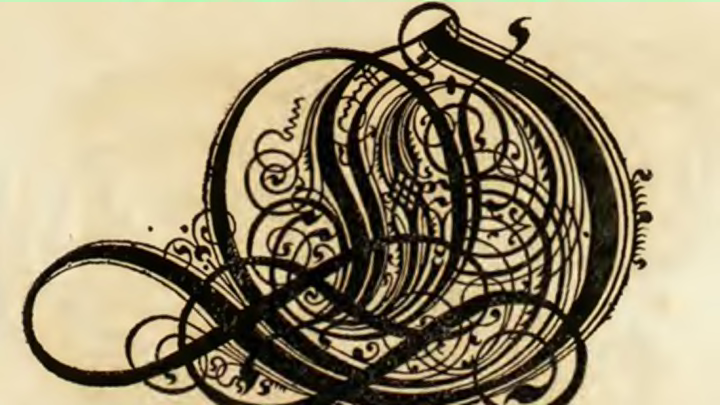
12 Os Made Complex by 17th Century Calligraphy
By Arika Okrent

Of all our letter forms, the O is arguably the simplest. One stroke moving in one direction. A circle, perhaps an oval, grounded and elemental. A pair of rounded lips, an eye, an egg, the earth. But in the hands of master calligraphers, the humble O can shed its simplicity, its symmetry, and even its bounded borders to perform feats of ‘O’ness that defy all expectation. Here are 12 O’s from a 17th century German book, The Proper Art of Writing: a compilation of all sorts of capital or initial letters of German, Latin and Italian fonts from different masters of the noble art of writing, each one more complex and beautiful than the one before it.
1. Classic.
Just the barest hint of tilt and variation in line thickness. Pure elegance.
2. A little more tilt.
A slender open channel. The O is leaning toward freedom.
3. Curves become points.
Air forces its way out in a tangle of swirling breezes.
4. More.
More lines, more shapes, stability in the base, chaos at center.
5. Stateliness returns.
The circle is squared, essence contained but not stilled.
6. The air bursts through.
Symmetry abandoned. New life forms within.
7. More Opening.
More sharpness. The O releases its tendrils of sound.
8. Almost Modern.
This was made in the 17th century. Long before Miró. Long before Picasso.
9. Together.
The circle comes back together, yet the lines are still open.
10. Symmetry returns.
Until you look at it more closely.
11. Circle Back.
Almost the pinnacle of ‘O’ness. The circle that goes on forever.
12. Elaborate.
Topped off with a dollop of infinity.
From Kunstrichtige Schreibart, via the Public Domain Review.