These Interactive Maps Can Help Professionals Target Cancer Control Efforts

Each year, more than 1.5 million people in the U.S. are diagnosed with cancer—and by 2020, this number is expected to swell to nearly 2 million, according to the Centers for Disease Control and Prevention. On an individual level, we can try to stay cancer-free by adopting a healthy lifestyle, getting regular screenings, and keeping up-to-date with the the latest preventative vaccinations. And by looking at cancer rates across the country, experts can figure out how best to target resources. “Cancer counts and rates are essential to measuring progress and targeting action toward this major cause of death among Americans,” the CDC’s website states.
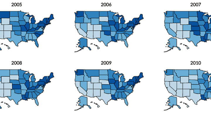
To monitor cancer trends across America, the government public health agency recently released a set of interactive maps (first spotted by Business Insider) that make it easy to see federal cancer trends from 2013. Users can use the tool to look at cancer data by cancer type, state, demographic, year, and more.
According to the CDC, "The data visualizations make it easy for anyone to access the latest and official U.S. cancer statistics to help cancer control efforts have the greatest impact. Cancer care and prevention professionals, planners, advocates, journalists and policymakers are encouraged to access this new tool to view and report cancer statistics."
We've listed a few key takeaways below, but to peruse the CDC's full data set, you can visit its interactive U.S. Cancer Statistics tool.
The rates of cancer deaths in the U.S. per 100,000 people, by state:
Rates of new cancer cases, state by state, per 100,000 people:
Most common types of cancer in new cases and in cancer deaths:
Nationwide changes in cancer rates:
[h/t Business Insider]